foodsense.is
16.11.09
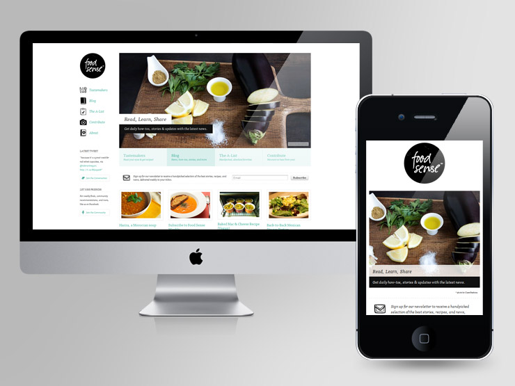
The foodsense.is has a minimal and fairly simple page layout with legible text, clear images, and a sense of hierarchy. The page for the computer version includes the essentials to a site such as the header logo, navigation bar, and posts to recent articles. The breakdown of the website is clear with a slideshow that is centered and is roughly 70% width of the page. The navigation bar and header logo is included in the last 30% width. The position of which the navigation is easily seen from the beginning since the left side is one of the most common places for it to be. The navigation also includes icons next to the titles to emphasize what it will lead the user to. The usability for the site on the computer is very clear since everything is positioned in an orderly fashion. However, there were a couple of minor things that could be improved upon. The slide show works but the timing could be modified to fit a smoother and a bit slower transition. There is also a second navigation bar under the slideshow with a different set of colors and is in a horizontal block. The color palette is nice but the contrast of the foreground to background of the horizontal navigation is not strong.
As for the mobile version, the breakdown is very different from the full site version. The site is condensed to a smaller and more vertical scroll with each post under each other. The navigation is now placed across the top of the page without the icons for each link. The mobile version also removed the social media aspects to it such as the email list, twitter, facebook, and pinterest. The usability and navigability is still there since it is still straightforward in terms of layout. However, because of the long scroll down in order to go to the posts, it would be nice to have a “back to top” button that is fixed to the page as the user scrolls in order to make it easily accessible to go back to the top and go to the navigation.
For both of the sites, they utilize the same typography, color palette, and imagery. It creates a sense of cohesiveness across the mobile and webpage designs. In terms of the breakpoint, both have strengths and weaknesses. However, the stronger breakpoint would be the webpage compared to the mobile page design because of the wider range with multiple aspects that add to the page. The long vertical scroll of the mobile page ruins the accessibility since it would make it harder for the user to manage if there were copious amounts of posts.